Visual identity for Hindenes Byggmester
Branding a "new but old" construction business.
Hindenes Byggmesterforretning was previously part of a fusion with two other firms and is now returning to its roots, transforming into a family business with a more personal touch. With years of experience, they wanted their new visual identity to communicate both modernity and competence.
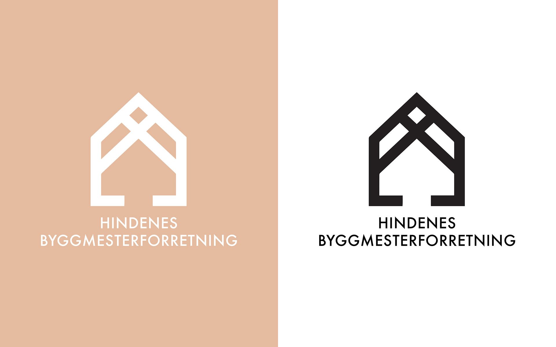
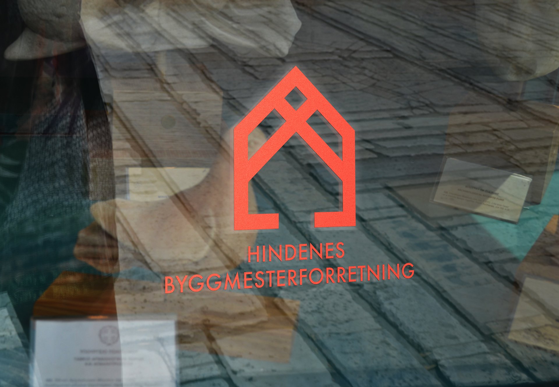
The result is a logo and two color palettes, with a modern yet conservative look. The house icon under construction leaves no doubt about the services they offer.
Visibility and Safety
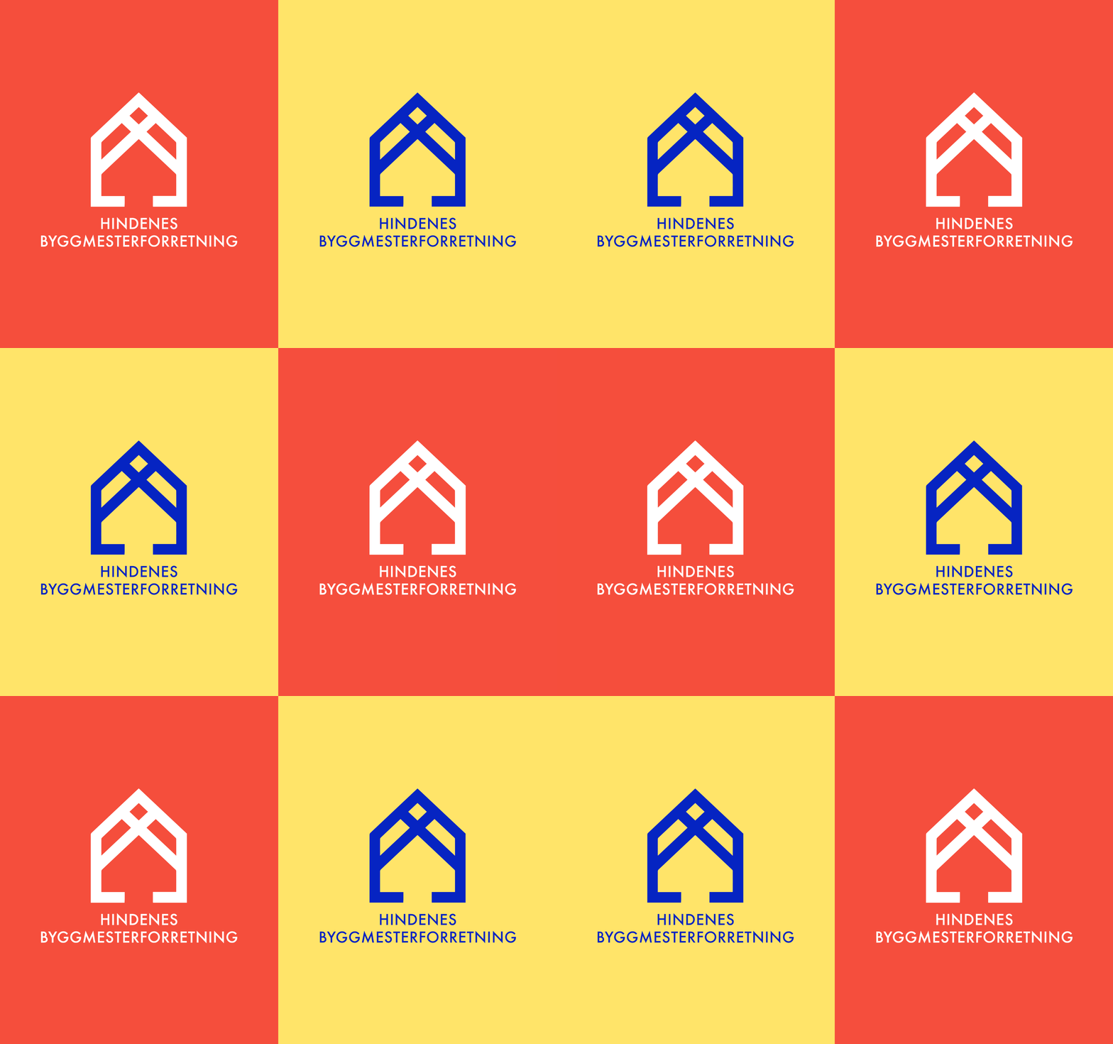
Two color palettes were chosen:
- A simple and limited palette for office supplies, signage, papers, and websites.
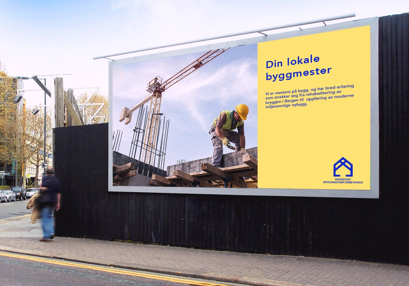
- A visibility-focused palette for work clothes, construction posters, and other settings where competitors are present. These colors ensure visibility and safety while adhering to traditional and conservative community norms.
